Decorating Using The 60/30/10 Rule
13th May 2020Posted by Laura Rich on 13th May 2020

Posted by Laura Rich on 13th May 2020
In general, I am not a fan of ‘rules’ per se - I think they are there to be broken when it comes to making our homes our own. But decorating using the 60/30/10 rule is really useful if you’re not sure where to start. In this blog I will talk all things decorating using the 60/30/10 rule and how you can create it easily using a feature wall.
Simply put, the 60/30/10 rule defines the proportions of how to use colour in a room to create a pleasing interior.
The idea is that you choose one main colour and use it in 60% of the room (on the walls, the flooring and/or in the larger items of furniture). It creates a base for everything else - think of it as a room primer.
Next, you choose a secondary colour and use it across about 30% of the room (think accent chairs, soft furnishings or a feature wall).
The 10% is saved for a final ‘pop’ of another colour which you use in - you guessed it - about 10% of the room. You can use accessories, greenery, soft furnishings or artwork to good effect here.
The secondary colour is important to get right as it will set the tone of the whole room; the feeling in the space. For example, if you choose a colour that is similar to the base colour, but different enough to add interest, it will support the 60% colour and create a complimentary feel. It will unify the room. If you choose a colour that is in contrast to the base colour, you will get a completely different overall feel.
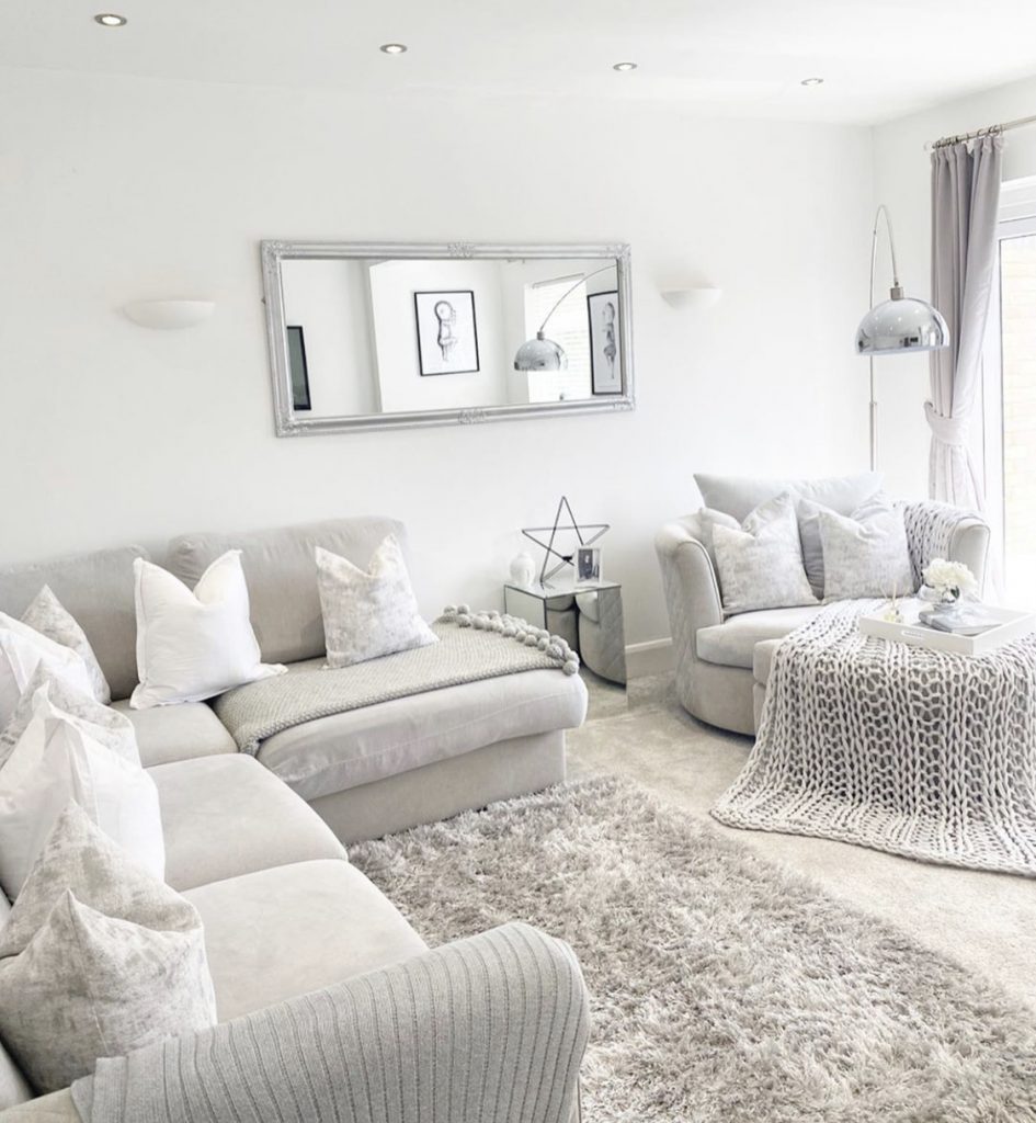
A complimentary room scheme with the 60/30 colours could be this light space by @khomeinterior. Using grey as the base colour and cream/white as the secondary colour. The tones are soft together so you get a unified soft palette. It is a relaxing space. You can just about see the 10% pop of black in the picture frames shown in the mirror.
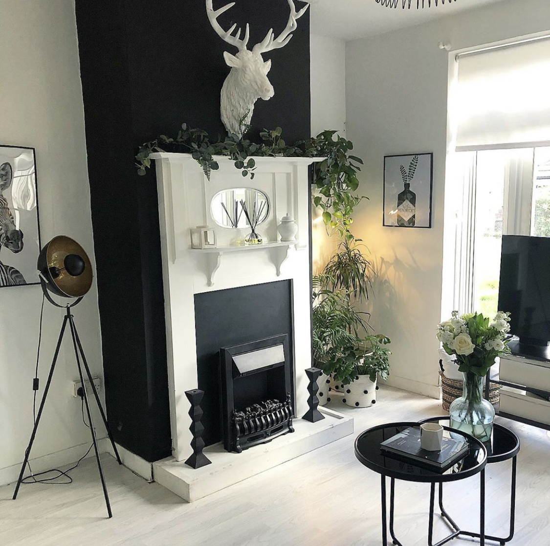
A contrasting room scheme like this one by @mydreamhome_usplus6 uses white as the base and black as the secondary colour. Because white and black have a higher contrast than grey and white the room feels more dramatic; it is homely and stylish but it also has a bit of ‘punch’.
In the example above, @mydreamhome_usplus6 has used plants to add a gorgeous 10% pop of green against the white and black.
If you’re not confident to pick colours that will work well together, a patterned wallpaper is a great way to start because the hard work is done for you! All you need do is choose a wallpaper you really like, then pick out colours from it for the 60% and 10%. The wallpaper itself will make up the 30% if you use it on one wall in the room.
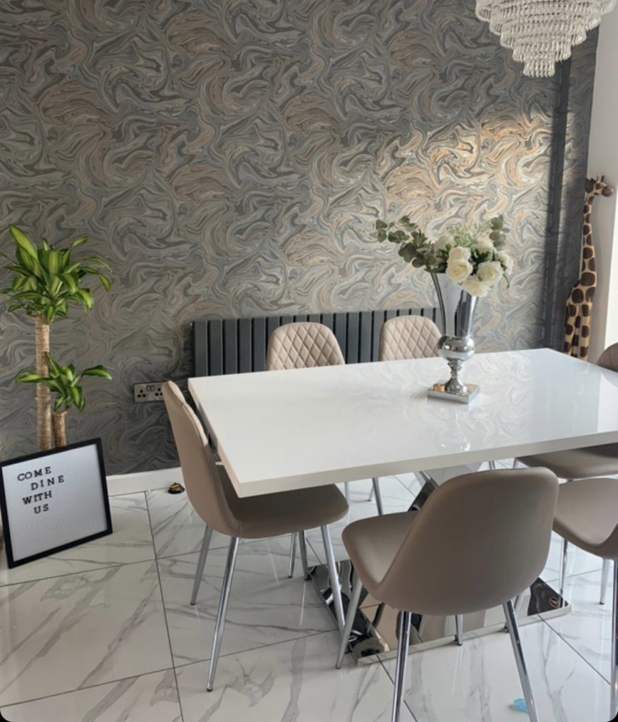
@loveourhomes has used this method here in her dining area. The gorgeous patterned wallpaper from ilovewallpaper.co.uk, offers up a palette of grey and white mixed with a warm pink/beige. The floor, ceiling and Atlanta table pick out the white of the wallpaper and create the base colour. The cappuccino grey chairs perfectly complement the pinky warm colour in the wallpaper as a secondary colour. The radiator picks out the darker grey of the wallpaper to make up the 10%. Overall, the room has a warm, inviting feel and shows a really good understanding of colour.
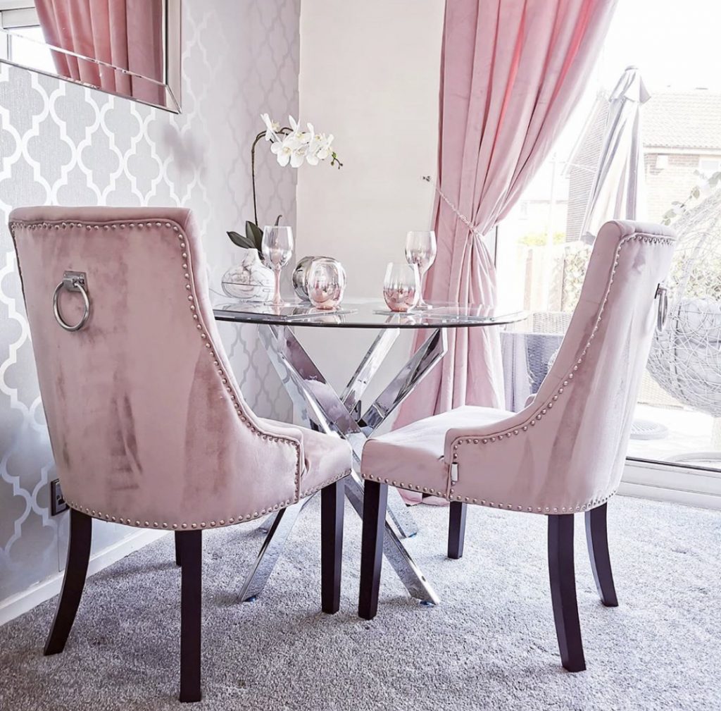
If you have a good handle on colour you can use a feature wall to add texture to a space. @hannahs.home.styling has created a stunning dining area here with grey as a base, pink as the secondary and the black of the chair legs for the contrasting ‘pop’. Whilst the wallpaper here is silver/grey to fit in with the base colour, it adds a lovely texture and sits perfectly with the Novara Table. *swoon*
At Furniturebox we carefully choose the colours of our dining chairs to work with a variety of colour palettes and make the most of the colour choices you make in your homes. And we love to see the results! Share your images with us at @furniturebox_uk