Paint & Perspective Using Colours of The Year & Colour Drenching
24th Jan 2024Posted by Alice Ewens on 24th Jan 2024

Posted by Alice Ewens on 24th Jan 2024
Paint yourself a new perspective with our handy guide on how strategic colour blocking and accent walls, or going all out with colour drenching, can dramatically change the look of your home without huge renovations and expenses! How will you paint yours?
View this post n Instagram
New year, new home and all that. Or, is it more like new year, new mile-long DIY to-do list? January is all about out with the old and in with the new, so many of us are looking to revamp our homes. Are you wishing your ceilings were higher? Your living room longer? Your dining room wider? One of the easiest ways to do this is with a lick of strategically-placed paint! Watch your space magically shrink, grow or stretch depending on how and where you apply paint.
It's also the time when the various paint experts publish their 'colours of the year' so we thought we'd kill two birds with one stone and show you how to incorporate your favourinte colour of the year with the colour drenching theme that you can use to change the perspectives and perceived space of your rooms.
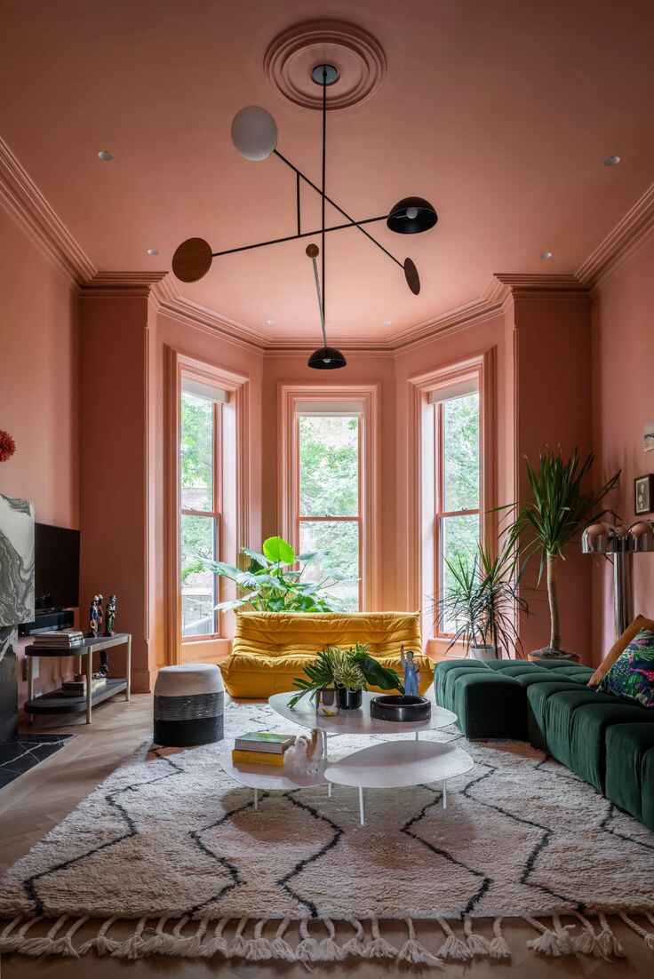
Our customer @at_home_with_the_pells illustrates perfectly how a statement colour-blocked wall can add dimension to a long, narrow room. The black panelled wall in the otherwise light room also matches our black bar stools beautifully!
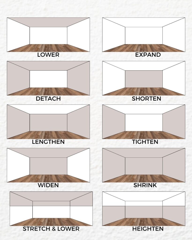
The graphic illustrates how easy it is to trick the mind's eye into seeing what we want it to!
Paint your ceiling a darker colour and have all walls a matching light colour to create the illusion of a lower ceiling. This is great for creating a cosy look without making the room feel cramped.
Leave all the walls light with a darker floor to make a room look much bigger!
One light accent wall amidst darker walls, floor and ceiling will lengthen and create a 'detached' window. This can work well on a smaller wall with no natural light - add a mirror to enhance this.
Two darker long walls and a light short wall + ceiling with bring the sides of the room in and narrow it. This works well for huge old rooms that feel a bit 'echoey' and cold. The opposite will widen a room, as per our customer example at the top of the blog.
Using a matching darker colour on all walls and ceiling will make a room look smaller and cosier.
A band of darker colour around the top of a room, above a picture rail for example, with a light ceiling will lower the ceiling but still keep a sense of width. And, the opposite - dark walls on the bottom half of the room will add height.
View this post on Instagram
Our customer @home88_ pairs our Leonardo glass table and cream Nora dining chairs with their cream and sage-green dining space - another gorgeous example of colour blocking.
View this post on Instagram
Don't be afraid to paint your ceilings and bring that down onto the walls for a chic yet cosy look.
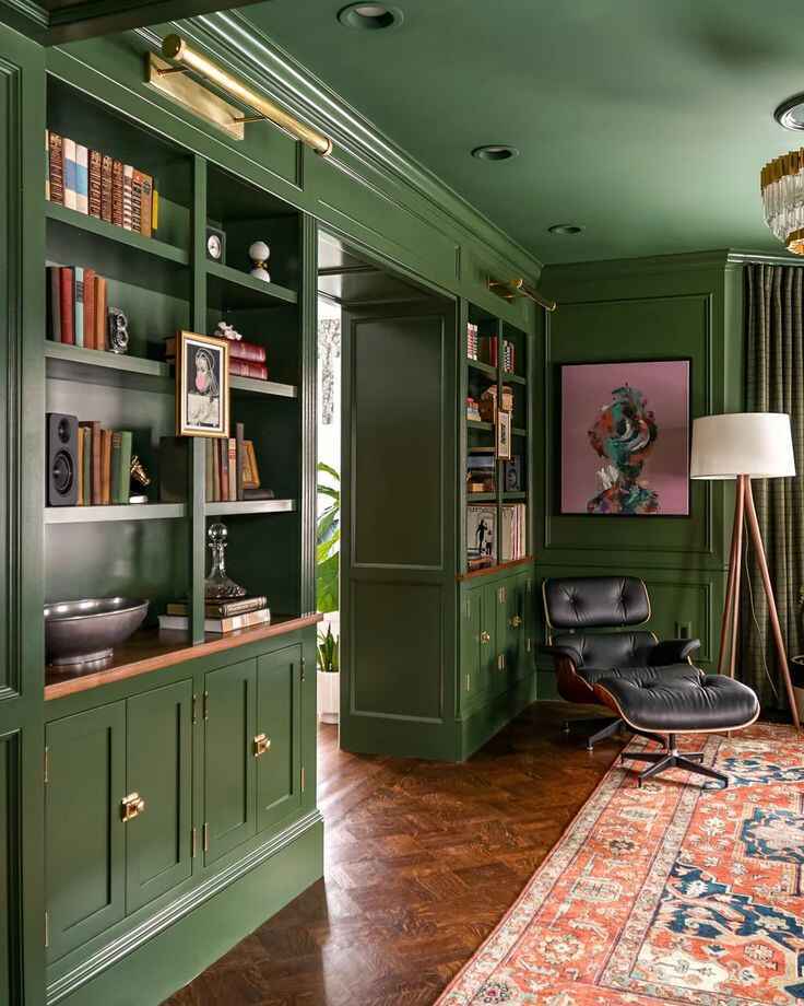
Colour drenching is the art of decorating a room in a single hue, from walls to furniture, and even accessories. Imagine stepping into a space where every element, from the sofa to the lampshade, sings the same colour tune. It creates a cohesive and immersive environment that feels well-thought-out and harmonious. It can be bold - green interiors are absolutely having their moment, so much so that ‘Millennial Green’ has taken over from ‘Millennial Grey’ as a bit of a joke in our office. Or, it can be subtle, with warm neutrals a gentler way to play the colour drenching game.
Whether you yearn for a terracotta and clay look, a French-inspired blue and neutral style or a fresh and timeless vintage green vibe, there's a combination here that will work for you that can help you make a statement or alter the sense of space in your room.

The essentials of good living room design can be hard to pin down when there's so much contradictory information out there. But, you can design your dream living room with a few handy insider tips from our resident artist and designer! [read more...]
Small living rooms can be a bit of a faff when it comes to furnishing. We've caught up with our Product Design Lead Laura to get the low down on the best layouts for small living rooms.
[read more]